Sydni Johnroe
Graphic Designer
Creative graphic designer specializing in brand identity and print design.
Let’s translate your vision into effective visual communications.

Branding Materials and Business Essentials
I believe that graphic design isn’t just about making a pretty poster, it’s about effectively communicating a message. My work combines aesthetics and communication in order to create designs that showcase your identity, values, and services in easily digestible formats.
Attract Customers With Eye-Catching Design
Brand Identity
Through specific questions and communication, I can develop a branding kit, advertisement set, and everything you need to create your unique brand. Using your existing logos, designs, and preferences, I can create branding materials that fit your business’s existing identity.
Logo Design
Through specific questions and communication, I can develop a unique logo for your business. I will work with you through sketches, color changes, and many iterations in order to find the perfect logo for you!
Print Design
I design print materials that are both useful and beautiful. Business cards, posters, packaging, and more. Using bold typography and unique layouts, my print materials are sure to bring attention to your business!
View Some of My Work
All Projects made with Adobe Illustrator and/or Photoshop unless otherwise stated. Click on each project to view the scope and skills involved.
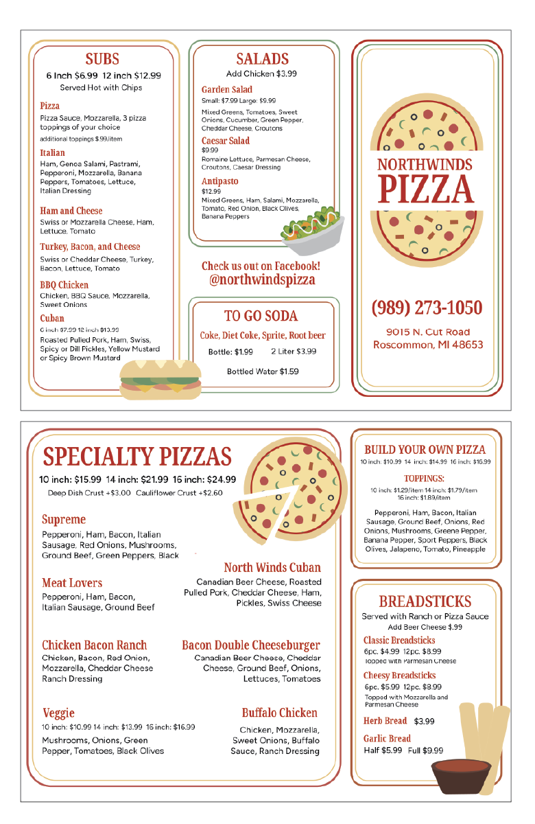
Northwinds Menu
This is a menu and logo for a local restaurant. Their existing menu had a few usability issues, including organization and hierarchy, so I decided to do a small rebrand for them as practice. My goals were to create a menu that was not only visually interesting and exciting, but also functional and easy to understand. Their existing logo uses a serif typeface, so I used one in my design to give the idea of a branding refresh rather than a total rebrand. They also had a black and white logo and menu, so I added in colors to reflect the warm and inviting nature of the restaurant. I created vectors that guide the eye without reading every piece of text in order to add more functionality and exciting energy to the menu. This project shaped my understanding of problem solving, as well as balance, hierarchy and consistency.
Promo Postcards
These projects are from a job I got at a local design company after inquiring about design internships near me. I was hired to work on designs used for promotional materials and advertisements. These are two postcard designs that would be sent out to clients about seasonally relevant or new products. I worked on developing my own personal style that still matched the brand image and needs of the business. One important aspect of the work here was keeping the product names/numbers where customers could easily find them so that they could order the products. I faced a few challenges balancing design with functionality, but in the end I went with what the company owner preferred.
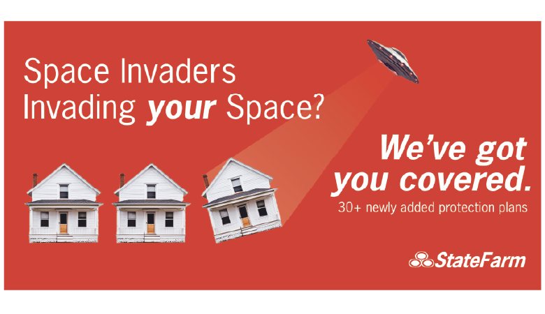
Statefarm Billboard
This project is from a beginner typography class. It’s one of the first projects I made using Adobe Illustrator and Photoshop. I wanted to see how a silly idea would fit into the branding of an existing company. I researched Statefarm’s existing branding, and then used a version of their typeface to create my billboard. This was one of my first times trying to match an existing brand image and I learned a lot about balance, typography and Illustrator in the process.
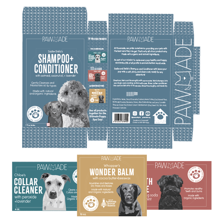
Pawmade Packaging
This is a project from my packaging design class. I wanted to use the pet portraits I had previously designed in an actual branding project. My goal was to make more elevated packaging that would appeal to pet owners who want high quality products. I enjoyed using typography to create that specific brand voice, as well as applying the branding to different products. I created many different icons for this project as well, which gave me practice with vector icons.
Branding
Ride Adventures Ad Campaign
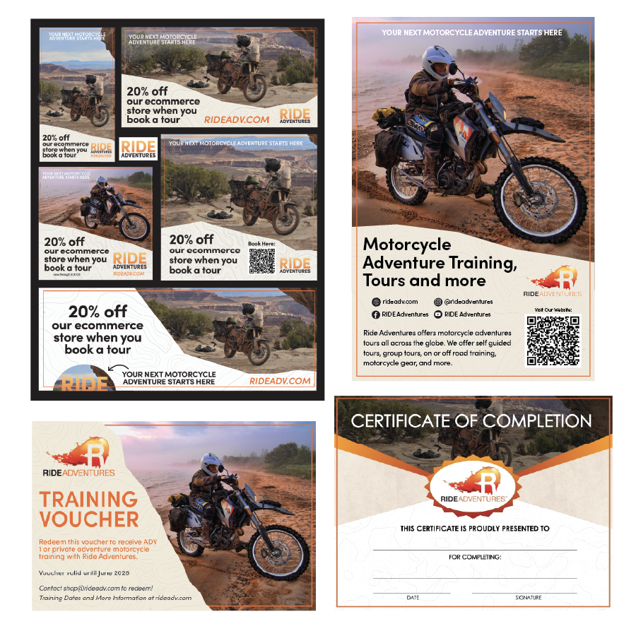
For one of my design courses, I designed a branding campaign for an existing company. I researched their existing branding in order to make my work match their established identity. For added practice, I redid their logo to be more modern and sleek, while still having a rugged feel that matches their brand identity. I have also been commissioned by this business to design vouchers and flyers for their advertising. My goal for these projects is to make their brand identity clear and consistent throughout different types of projects, while still adding a more elevated feel.
Certificate of Completion created using Canva.
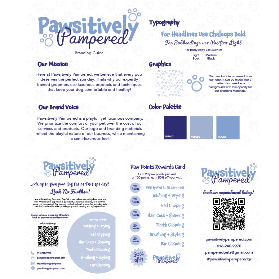
Pawsitively Pampered
Branding Guide, Poster and Business Cards are from a Mockup Client/ Designer project for one of my classes. I came up with the assignment idea so that my classmates and I could get a better feel for real world designing. I was given a few basic characteristics the “client” wanted to see in the final products. She wanted something playful, yet luxurious. My goal was to find the perfect balance between playful and luxurious through typography, icons and colors. Using the logo paw icons as a background pattern added more visual interest and fun energy to the designs.
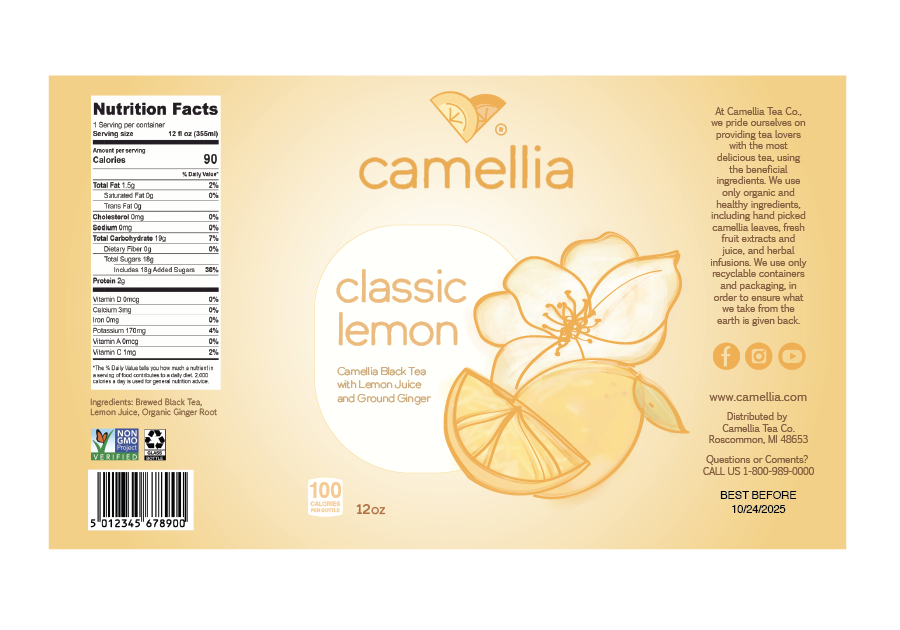
Camellia Bottle Label
Both of the Camellia projects come from a package design class. We were asked to make bottle packaging and a table tent for any beverage, as well as the logo and branding for the beverage we chose. One of my goals was to incorporate digital illustrations, which is not something I usually do in my work. I created the illustrations to add to the natural feel of the brand, since they pride themselves on being environmentally conscious and using organic ingredients. The colors and typeface also add to this natural feel, overall creating a cohesive brand identity.
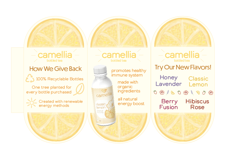
Camellia Table Tent
Both of the Camellia projects come from a package design class. We were asked to make bottle packaging and a table tent for any beverage, as well as the logo and branding for whatever beverage we chose. I wanted my table tent to attract people, so I went with bright colors and a unique shape. The citrus illustrations tell you what the product is without needing to read the text first. I kept the text minimal and used icons in order to quickly promote the product without too much attention from the viewer.
Logos
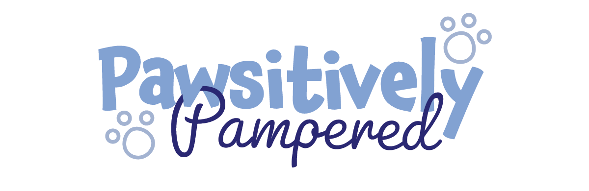
Pawsitively Pampered Logo
I made this design for a fictional client-designer project. I created this logo to reflect the fun yet luxurious energy the client was looking for. I used colors, symbols, and typography to create a specific feel and identity. The typography creates more of a fun feel, while the colors add the luxury elements. The paw print icons are used as a background pattern in other designs in order to add more visual interest and add to the overall fun energy of the company.
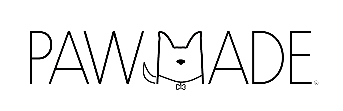
Pawmade Logo
This logo is from another package design class project. I wanted to try my hand at a higher end style and voice, while still keeping the logo similar to the styles of other pet product brands. I chose a thin sans serif typeface for this reason. I also knew I wanted to have different colored boxes for each package I made, so I kept the logo a simple black or white. This allowed me to put the logo on any background while still being legible. I went through a lot of different versions of the dog in the M. I had to change the line width, the spacing, and the amount of detail in the icon, and overall the end product accomplishes the goals I had for this project.
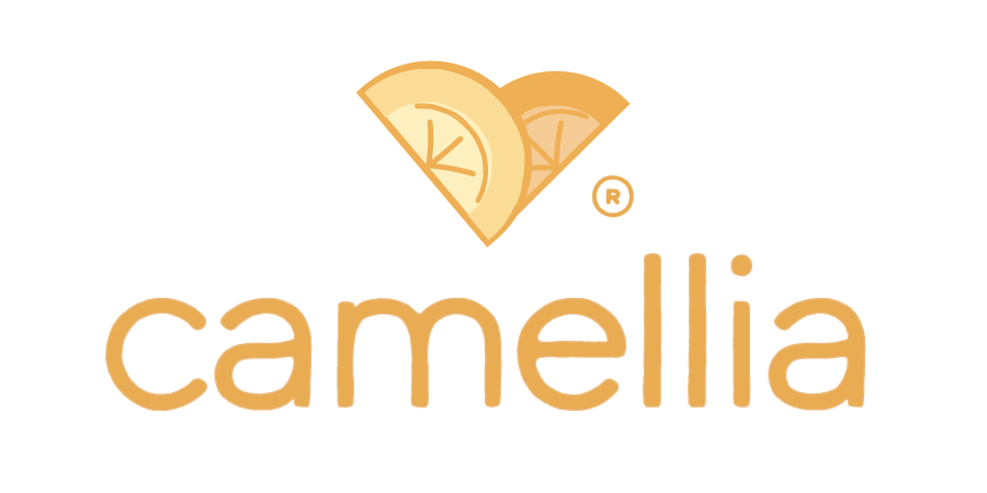
Camellia Logo
This is from a package design class that I took. We were tasked with making the logo and branding for a fictional beverage brand. The drink I chose was a tea company, which is why I chose the name Camellia – the plant that tea leaves come from. I wanted to create a brand that was environmentally conscious and used organic ingredients. In order to showcase these characteristics, I went with a typeface that was simple and friendly. I also used the citrus slices to create a heart shape, which highlights their attention to the earth and the health of their customers.
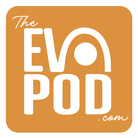
Evopod Square Logo
This logo is a commission from a start up. I worked with the client to guide them into understanding what a logo is, what it does for your business, and also what their overall brand voice is. We went through multiple iterations of this logo, some ideas from the client, and some ideas from me. In the end we combined a few of our ideas to get the final logo. This logo gave me the opportunity to learn about changing logos for different uses or shapes, and creating a favicon. I also gained experience in asking guided questions in order to help myself and my client understand exactly what they were looking for in their design.
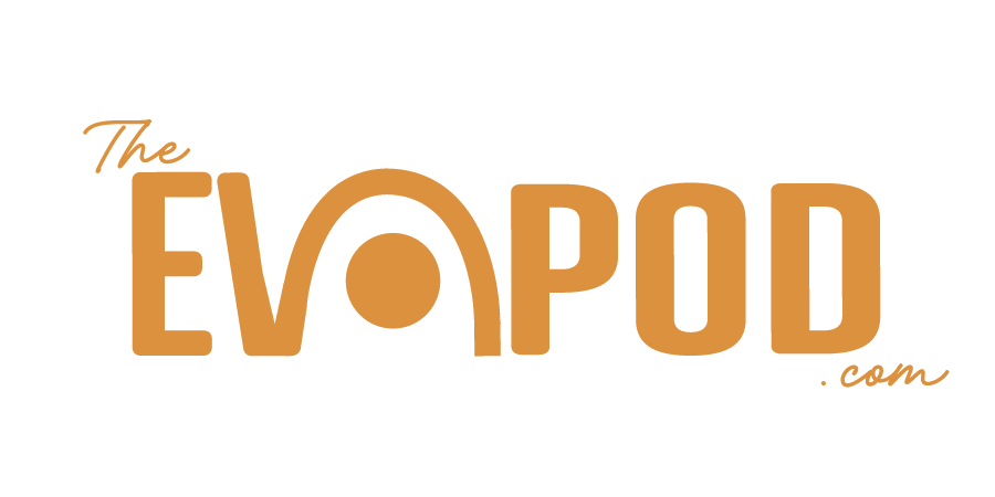
Evopod Rectangle Logo
This logo is a commission from a start up. I worked with the client to guide them into understanding what a logo is, what it does for your business, and also what their overall brand voice is. We went through multiple iterations of this logo, some ideas from the client, and some ideas from me. In the end we combined a few of our ideas to get the final logo. This logo gave me the opportunity to learn about changing logos for different uses or shapes, and creating a favicon. I also gained experience in asking guided questions in order to help myself and my client understand exactly what they were looking for in their design.